

Houseparty
MOBILE REDESIGN
DURATION
8 Weeks
Apr — May 2020
TEAM
Solo Project
MY ROLE
Brand Design: Designing consistent icon system, creating a new color palette, establishing new typography.
UX/ UI Design: Collecting all content offered from original app design together, wireframing content into a fresher, more organized way, designing with new branded material.
TOOLS
Adobe XD
Figma
OVERVIEW
THE CHALLENGE
While providing various forms of entertainment in one place, Houseparty also has various ways of navigating through the app to eventually end up in the same place. This disorganized and cluttered content architecture makes it difficult for users to get themselves through the app, trying to figure out a solid route to a specific screen. In addition, the inconsistencies in icon design and color palette make it hard to understand what’s really going on in the app. These all come together to create a perplexing experience.
THE SOLUTION
Generally, simplifying and organizing the content conveniently throughout the app with visually pleasing graphics can really help to guide users through their experience.
SAY HELLO TO HOUSEPARTY!
TARGET AUDIENCE
Houseparty is a social networking service that enables group video chatting and gaming through mobile and desktop apps. Users are notified when friends are online and available to group video chat and have the option to message individuals and groupchats. During group calls, users can play games in real-time with their friends to create fun memories.
Houseparty is for friends who want to connect when they are not physically together. The app is generally for all ages but is geared towards Gen Z and Generation Alpha. This younger crowd who is accustomed to video chatting and group messaging can find this application fun when games are added to the function.
Gen Z: 18-24 years
Generation Alpha: 7-17 years
UI DESIGN
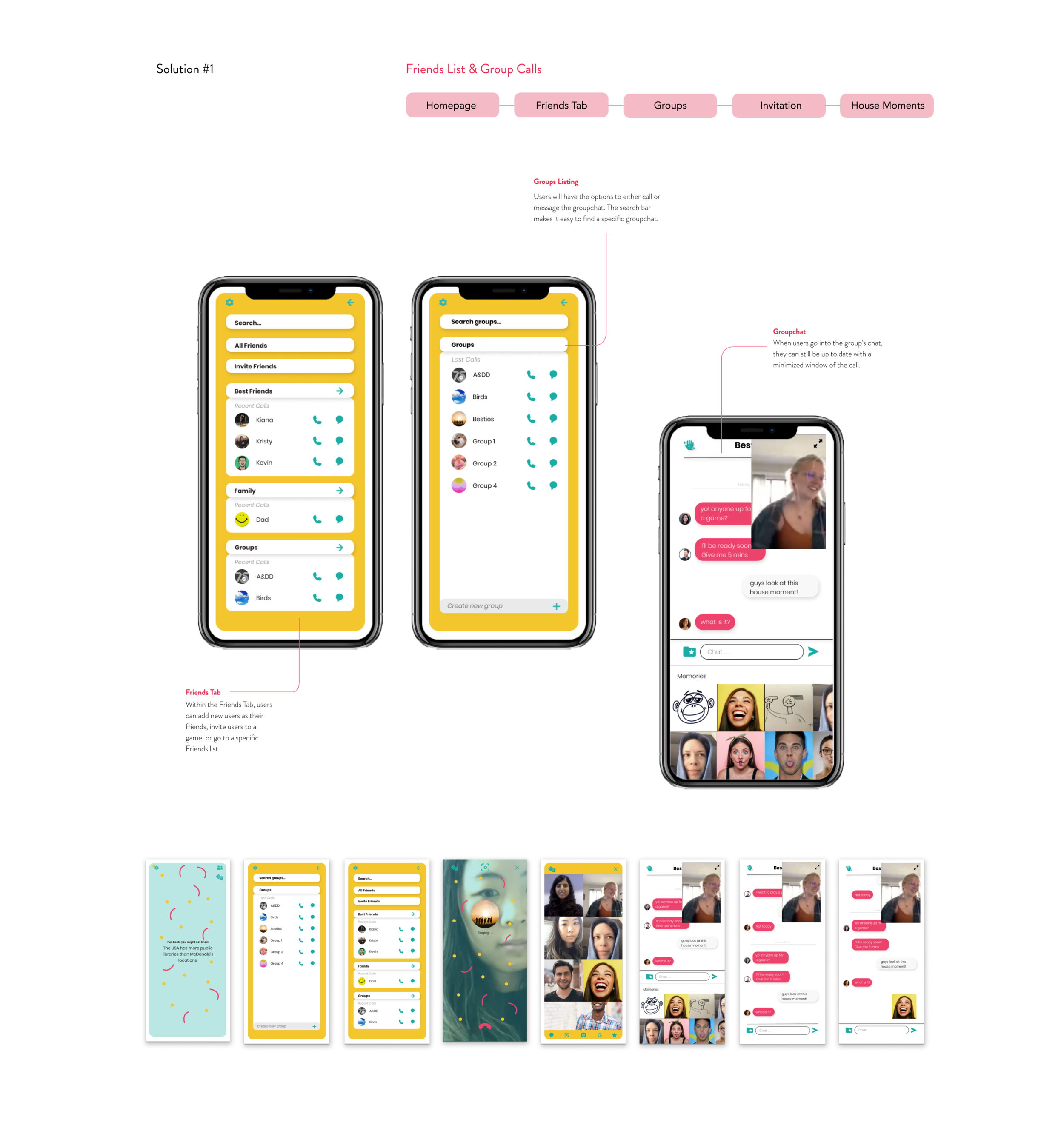
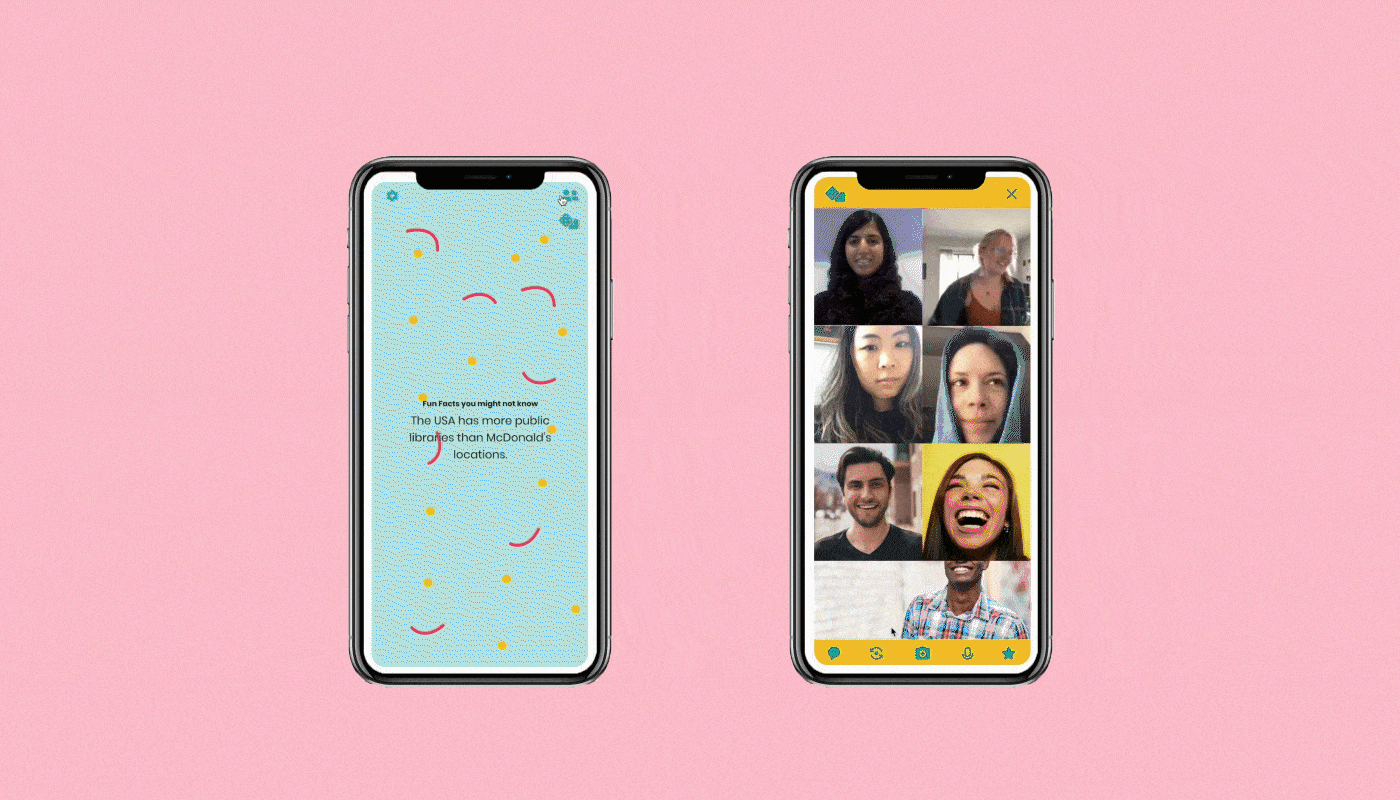
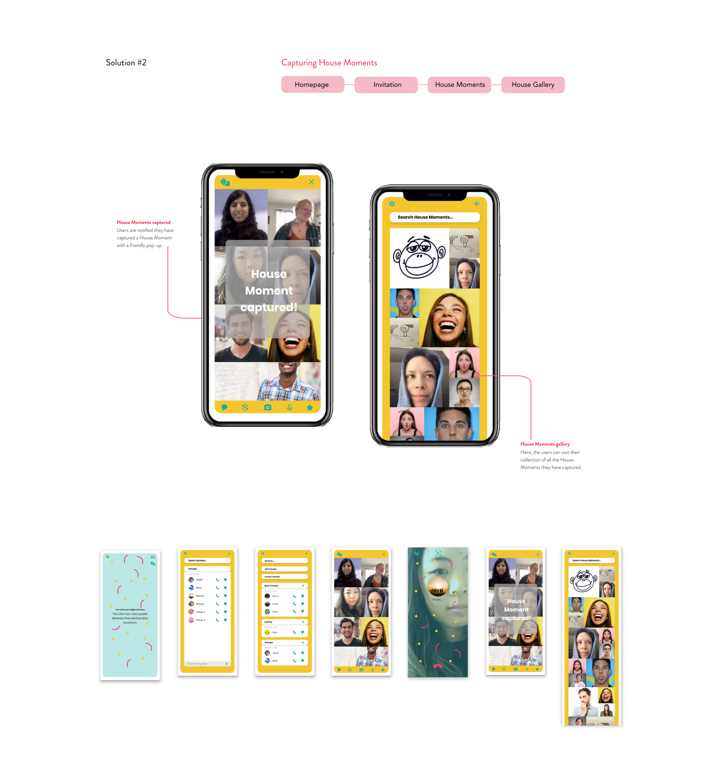
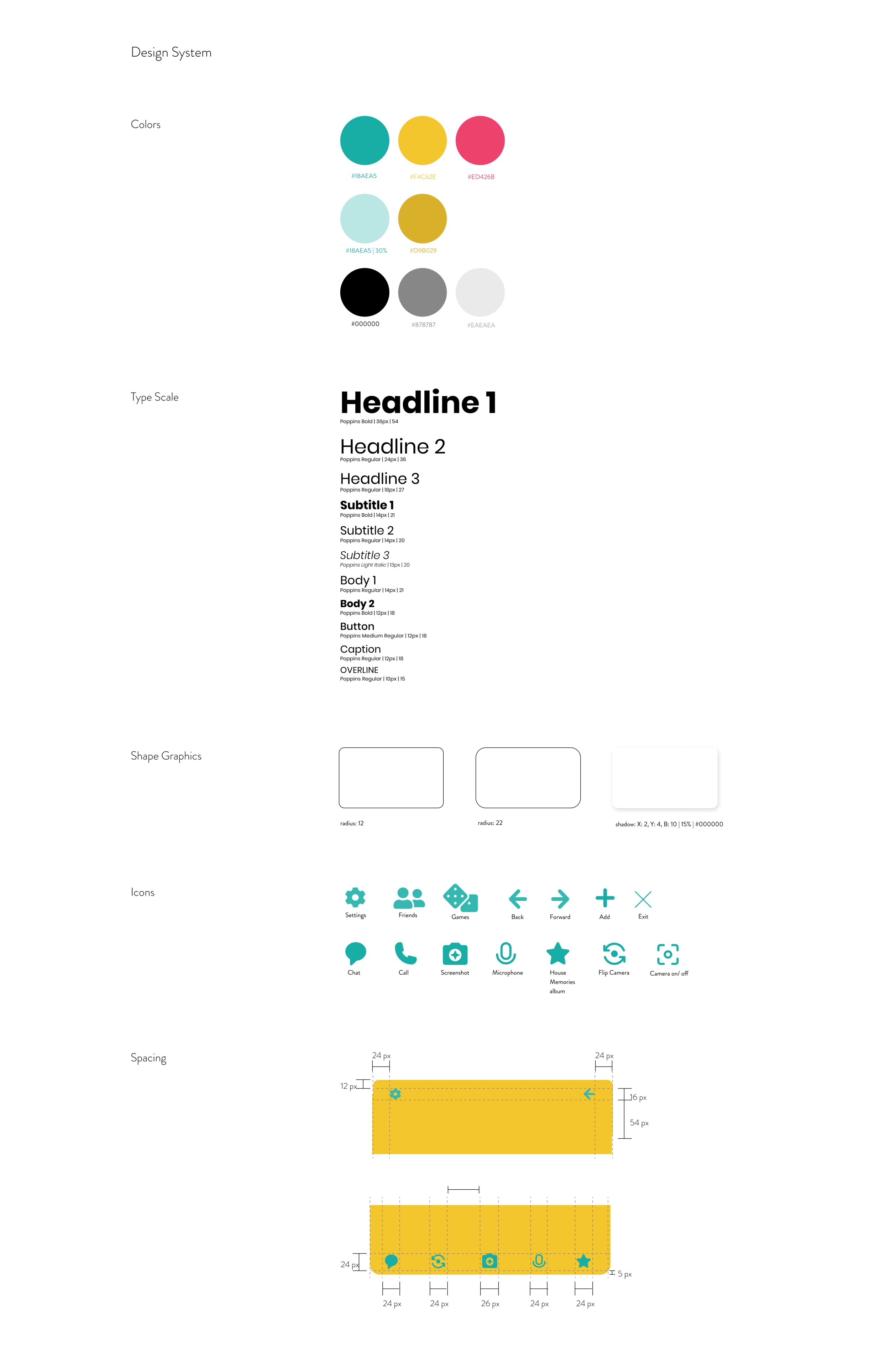
We wanted a way to organize the content in a way that allows the users to easily flow through the app, all while keeping the brand identity. We also integrated vibrant colors to emphasize the fun and games aspects of this application.

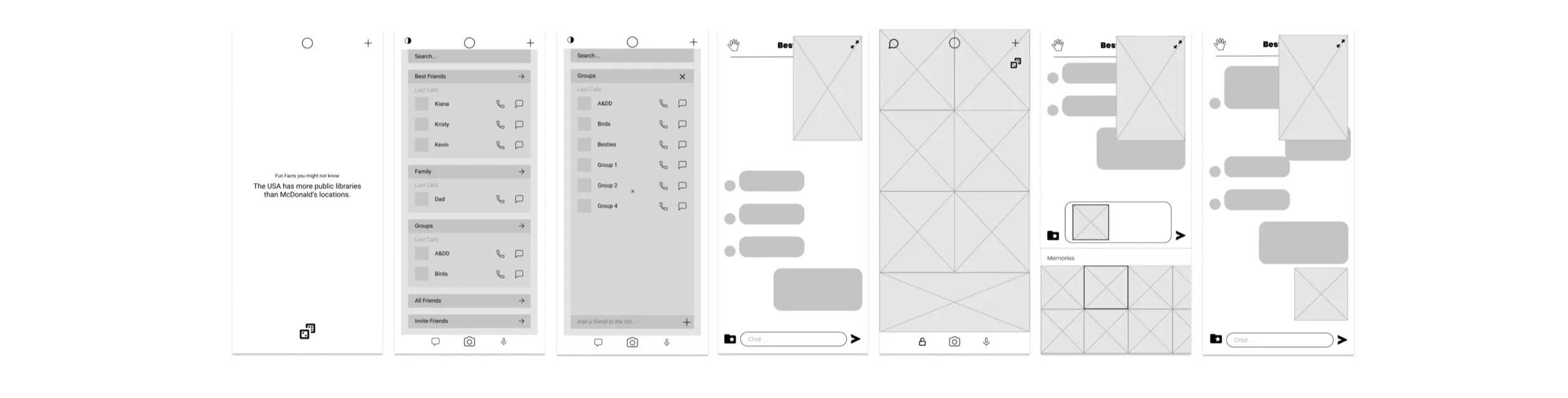
WIREFRAMES
When creating the wireframes, I focused more on the organization of the content and the different screens it would navigate the users to. By placing the similar app features together (calling features, Friend features, gaming features, etc), I took several walkthroughs to make sure the app’s features flowed within each other.
TAKEAWAYS
UPGRADE AND PRESERVE
Redesigning a UI design involves creating a fresh look and feel while staying along the lines of the brand’s design system. You want the users to know that it is the same application with a new design.
CATEGORIZE AND ORGANIZE
Having the content of the existing app helps to see and understand what part of it is unnecessary, where the users would have a difficult experience, and what areas of the information architecture we can improve. By organizing the content by categories (Friend features, House Moments, calling, and gaming features) we can develop a much simpler and easy to navigate.